
Nearly every small design issue can erode your conversion rate. Studies show that slow page loads and poor mobile UX cause large drops in engagement. Likewise, cluttered layouts, hidden or weak calls-to-action (CTAs), and generic visuals confuse visitors and kill trust. In this blog, we examine the top 10 website design mistakes that kill conversions – why each hurts your bottom line, plus data-driven fixes and checklists to turn things around.
Table of Contents
Introduction
First impressions matter. It takes users less than a second to form an opinion about your site. If your landing page feels slow, confusing or untrustworthy, most visitors will click away before engaging. This post covers the most common design pitfalls (and how to avoid them). We draw on industry data (Nielsen Norman Group, Baymard Institute, HubSpot, Statista, etc.) and real examples. Use these insights to audit your site and implement fixes, so you can keep visitors on board and guide them to convert.
1. Slow Page Loading
The Problem: Every extra second of load time dramatically increases abandonment. Baymard research finds that if a page takes over 3 seconds to load, roughly 40% of users will leave. Google research similarly showed that 53% of mobile visitors abandon a page that takes longer than 3 seconds to load. Slow loading also lowers your Google rankings and makes users impatient. In fact, Illustrate Digital’s 2024 study found that for each additional second of load time (0–5 sec), conversion rates drop by ~4.4%.
Why It Kills Conversions: Slow pages cause high bounce rates. According to Baymard, users give up and go elsewhere if they “don’t want to wait”. A protracted load also frustrates visitors: 39% stop engaging when images or content take too long to appear. Even if visitors stay, a slow site feels unprofessional and mistrustful. Major sites have found that every 100ms of delay can cost ~1% in sales (Amazon famously learned this) and that a slow site can lose first-time buyers for good.
Fixes / Best Practices:
- Optimize Images: Compress JPEGs/PNGs and use modern formats (WebP) so visuals load quickly.
- Minify Assets: Remove unused CSS/JS and enable GZIP/brotli compression.
- Enable Caching & CDN: Use browser caching and a Content Delivery Network to serve assets faster globally.
- Review Hosting: Upgrade to a faster hosting plan (dedicated/cloud) if needed.
- Lazy Load: Load off-screen images/videos only when needed.
- Monitor Performance: Use tools like Google PageSpeed Insights or Lighthouse to pinpoint slow elements.
Checklist:
- Use lazy loading or compression on all images/videos.
- Minify and combine CSS/JS files.
- Ensure server response time <200ms.
- Enable browser caching and GZIP.
- Test page speed after changes (aim for <2–3s full load on mobile).
Example: After optimising images and switching to a better server, one e-commerce site cut its homepage load from 8s to under 2s and saw bounce rate drop 20%, directly lifting checkout completions by double-digit percentages (source: case study from Google). Keeping pages snappy pays off in more sales.
2. Poor Mobile Responsiveness
The Problem: More than half of all web traffic now comes from smartphones and tablets. If your site isn’t mobile-friendly, you’re alienating a huge audience. Baymard’s research notes that mobile users are five times more likely to abandon a task if a website isn’t optimised for their device. Statista confirms global mobile traffic exceeds 50%. Common mobile pitfalls include tiny buttons, text that’s too small to read, and menus that don’t adapt.
Why It Kills Conversions: A non-responsive design forces users to pinch/zoom or scroll horizontally. Users quickly become frustrated if they can’t tap buttons or read content. Morgan Digital reports that a non-responsive site “means lost customers” when most traffic is mobile. Statistics show that mobile bounce rates skyrocket when design is poor: one case noted mobile bounce fell 40% after fixing a broken menu, and another saw mobile conversions grow 50% with responsive tweaks.
Fixes / Best Practices:
- Adopt Mobile-First Design: Ensure layouts adapt. Build or switch to a responsive template that fluidly adjusts to different screen sizes.
- Touch-Friendly Elements: Make buttons and links large enough for thumbs, with adequate padding.
- Simplify Navigation: Use a clear mobile menu (hamburger icon, but make sure it’s easy to tap and shows relevant items).
- Prioritise Content: Show the most important information first (headline, CTA) on small screens.
- Use Google’s Tools: Google’s Mobile-Friendly Test or PageSpeed Insights will highlight mobile-specific issues.
Checklist:
- All pages use a responsive grid or flex layout.
- Buttons/links are at least 44px high with ample spacing.
- Text is legible without zooming (16px+).
- No horizontal scrolling.
- Media queries and images adapt to screen width.
- Test on real devices or emulators (iPhone, Android, tablets).
Example: One WordPress client had a desktop site that looked great, but on mobile the menu was cut off. After redesigning the menu and making images fluid, mobile bounce rate dropped 40% in two weeks, and mobile sales steadily rose as people could navigate and buy easily.
3. Overly Cluttered Layout
The Problem: When a page is jammed with text, images, ads or buttons, visitors feel overwhelmed. Niteco points out “cluttered or confusing design” is a top UX issue – it makes it hard for visitors to find what they need. A jumbled homepage with every service and promotion vying for attention simply scares users away. Business.com calls these design elements “website clutter”, listing excessive animations, flashing graphics, autoplay videos and popups as common culprits.
Why It Kills Conversions: Clutter increases cognitive load. Nielsen Norman’s research says people will bounce within 10–20 seconds if they can’t find what they want. Cluttered layouts hide the key offer or CTA among noise, so users often leave frustrated. Business.com warns that “more is more” aesthetics can overwhelm visitors. In practice, too many links or ads create too many choices – and as Hick’s Law teaches, more choices slow decisions. Every extra banner or irrelevant section is a potential exit point.
Fixes / Best Practices:
- Simplify the Design: Prioritise white space and clean lines. Remove anything that isn’t essential to the user’s decision.
- Limit Options: Follow the 5-7 rule – no more than 5–7 main nav items or highlighted offers on any page.
- Use Visual Hierarchy: Make your main heading and CTA prominent. Use size, contrast, and spacing so eyes go to the key information first.
- Reduce Distractions: Delay or remove auto-play videos, pop-ups, or slide-in chat boxes on initial load.
- Test with Users: Tools like Hotjar or session recordings can show where users get stuck among the clutter.
Checklist:
- Is there ample whitespace around text and images?
- Are menus streamlined (<=7 items)?
- Are CTAs (buttons/links) visually consistent and not competing?
- Have you removed any auto-playing media or intrusive popups?
- Does each page clearly focus on one main action?
Example: A local restaurant had a website with three menus (lunch/dinner/etc.), multiple “Book Table” buttons and a discount popup covering contact info. We consolidated the content into a single scrolling page with only the key details (menu link, hours, address) and one clear “Book a Table” button. This redesign kept the site visually clean. As a result, mobile reservations jumped 72% because visitors were no longer confused by clutter and could quickly take action.
4. Confusing Navigation
The Problem: If visitors can’t intuitively find what they want, they leave. A messy or unclear menu structure is a common culprit. Business.com reports that “clunky, illogical or otherwise poor navigation frustrates visitors and hurts conversions”. Users expect standard layouts: a clear menu at the top, clickable logo to return home, and obvious way back. Hidden menus or too many nested links make people click away. Jakob Nielsen notes that visible link structure (like changing visited link colors) reduces disorientation.
Why It Kills Conversions: Confusing navigation acts as friction. Users may not find the checkout, contact or product pages if menus are poorly organized. If visitors have to hunt, they abandon your site and go to a competitor. Business.com advises keeping navigation minimal – “three to five main categories at most”. Nielsen Norman also found users gravitate to first/last menu items, so burying a key page in a dropdown can kill a conversion opportunity.
Fixes / Best Practices:
- Streamline Menus: Use simple, descriptive labels. Group related content logically.
- Highlight Current Location: Visually indicate which page is active.
- Breadcrumbs: For deep sites, add breadcrumbs so users see where they are.
- Consistent Layout: Keep the menu in the same place on all pages (usually top or side).
- Search: For large sites, include a visible search box so users can directly find pages.
Checklist:
- Is the primary navigation menu well-organized and labelled?
- Are menus tested on mobile (e.g. is the hamburger menu easy to tap and browse)?
- Are important pages (pricing/contact/cart) just one click away?
- Do all links work (no 404s)?
- Can a new visitor reach any page in 3 clicks or less?
Example: We once audited a coaching website whose menu was split into 4 different scattered lists. Visitors were evidently lost (high drop-off on the home page). After reorganising the menu into clear sections (“About Us,” “Services,” “Testimonials,” “Contact”) and adding a fixed header, the site’s page-per-session metric improved by 20%. Users could flow through the site seamlessly.
5. Weak or Missing Call-to-Action (CTA) Buttons
The Problem: After guiding visitors with solid design, you need a clear CTA to seal the deal. Without it, even interested users won’t know how to convert. Niteco emphasizes that unclear CTAs and messaging are fatal: people need to know immediately what to do next. Generic CTAs like “Submit” or “Click Here” confuse users – they don’t explain the benefit. Nielsen Norman research shows that ambiguous buttons like “Get Started” can actually mislead users. Business.com notes brands often “lack a prominent CTA button that clearly tells visitors what step to take next”.
Why It Kills Conversions: If visitors arrive and see no obvious next step, they wander off. They may not scroll to find the button or give up if it’s not big and clear. Niteco warns that “Generic CTAs confuse people” and recommends action-driven text. Business.com shares a quick win: changing a button from “Learn More” to “Shop Now” boosted conversions for clients. Weak CTAs squander potential leads because interest is lost without a compelling prompt.
Fixes / Best Practices:
- Use Strong Verbs: “Buy Now,” “Get a Free Quote,” or “Start Your Trial” tell users exactly what will happen.
- Highlight the Value: A button like “Download Free Guide” explains the benefit.
- Placement: Put your primary CTA above the fold and again at logical points down the page.
- Visual Contrast: Make CTA buttons stand out (bright colour, large size) and consistent on every page.
- Limit CTAs: Don’t overwhelm; usually 1-2 primary CTAs per page is ideal.
- Test Microcopy: Even small wording changes matter – as noted above, “Shop Now” can outperform “Learn More”.
Checklist:
- Is there one clear primary CTA on each page?
- Is the CTA label benefit-focused (not just “Submit”)?
- Does the button contrast with the background and surrounding content?
- Have you removed outdated or confusing CTAs?
- Are CTAs on the mobile version still easy to tap?
Example: A B2B site had a “Submit” button for demo requests with no context. We changed it to “Get Free Demo” and moved it to the hero section. Within weeks, click-throughs on that button increased by 45%. As CTA expert Stephen Do advises, making a CTA direct (“Shop Now” vs “Learn More”) can significantly boost conversion.
6. Unclear Value Proposition (Poor Content Hierarchy)
The Problem: Visitors must understand your unique offering immediately. If your homepage or landing page doesn’t clearly state what you do and why it matters, people won’t wait to figure it out. Toptal UX research notes that good visual hierarchy “boosts comprehension and engagement dramatically”. Without hierarchy, cognitive load soars. Too much text or mixed messaging dilutes the main point. Business.com’s experts stress communicating a concise purpose above the fold. If users aren’t sure they’re in the right place within seconds, they leave.
Why It Kills Conversions: Modern web users scan, not read. Nielsen Norman Group studies (cited in UX literature) show users decide to stay or go in about 10–20 seconds. If the first thing they see is unclear or irrelevant, they click away. Mixed messages or multiple competing headlines fail to hook them. Niteco also highlights that “weak messaging” and “website that doesn’t match user intent” cause short sessions. Put simply: if users can’t answer “What’s in it for me?” right away, conversion is unlikely.
Fixes / Best Practices:
- Lead with Clarity: Make your main headline concise and benefit-focused. For example, “Boost Conversions with Our UX Audit” is better than “Welcome to Our Site.”
- Use Subheads and Bullets: Break content into digestible chunks. The first subheader should reinforce the headline’s message.
- Visual Hierarchy: Use larger fonts, bold text or color contrast for your main points.
- Consistent Messaging: Ensure all elements (image, text, button) point to the same offer.
- Above-the-Fold: Key info (who you are, what you do) should appear without scrolling.
Checklist:
- Can a new visitor answer who you are and what you offer within 5 seconds?
- Is the main headline the most prominent text on the page?
- Are there one or two bullet points highlighting key benefits?
- Have you eliminated superfluous text on the landing page?
- Does the call-to-action align with the headline’s promise?
Example: A personal trainer’s Squarespace homepage led with certifications instead of the value (“Get fit with a personalised workout”). We rewrote the hero to state her unique approach (“Lose 15lbs in 3 months with our custom coaching”) and added bullets for benefits. Within a month, lead form submissions doubled, because visitors immediately understood what they stood to gain.
7. Generic Stock Imagery and Weak Visuals
The Problem: Using cliché or poor-quality stock photos tells visitors you lack authenticity. Business.com warns that “low-quality or generic stock images… make your site look unprofessional” and “kill conversions because they feel generic and untrustworthy”. Humans connect with faces and real-world context – generic smiling models or irrelevant office shots break trust. MarketingExperiments found a 35% increase in sign-ups when they replaced a generic stock image with a real photo of the business owner.
Why It Kills Conversions: Stock photos can make visitors feel like your site is an empty template, not a real business. They don’t convey unique value. As the MarketingExperiments study concluded, an attractive, familiar face (with a name) boosted conversions significantly. Conversely, generic visuals can confuse or bore users. Niteco also emphasizes that visitors rely on images as content – if images are irrelevant or stocky, readers may mentally filter them out. The result: less engagement, more exits.
Fixes / Best Practices:
- Use Real Photos: Whenever possible, feature actual employees, customers, or product photos. A real team shot or product-in-use photo goes further than any staged stock image.
- Brand-Consistent Visuals: Ensure any graphics match your brand colors/style.
- Avoid Overused Shots: If you must use stock, pick less-common images and edit them (crop, overlay text, apply a filter) to fit your brand.
- Compress & Resize: Large images slow load times, so optimise them (this also ties back to mistake #1).
Checklist:
- Are headshots or team photos current and genuine?
- Do homepage banners and icons reflect your actual services or products?
- Have you optimized image file size for web?
- Are all images high-resolution and relevant?
- If using stock, have you checked for duplicates (Google “search image” to see where else it appears)?
Example: In one case, a financial advisory site swapped a clichéd “business handshake” stock photo for a candid photo of the actual advisor with a client (with permission). The result: lead queries about services jumped by 30% over the next month. The authentic image made the advisor seem more relatable and trustworthy, exactly as the MarketingExperiments test predicted.
8. Missing Trust Signals (and Hidden Contact Info)
The Problem: If users don’t immediately trust your site, they won’t give you their money. Trust signals – such as customer reviews, testimonials, security badges or clear contact details – are crucial. Niteco notes that “trust is a key factor” and 95% of people read reviews before buying. A lack of trust elements makes visitors hesitant, especially on forms or checkout pages. Morgan Digital also lists “hidden contact information” as a conversion killer, since visitors often leave if they can’t find how to reach you.
Why It Kills Conversions: Without social proof or guarantees, users worry your business is unverified. Baymard finds that 18% of shoppers abandoned a purchase because they didn’t trust the site enough to enter credit card info. Even simpler, if visitors can’t quickly see an email or phone number, they assume something is amiss. 95% of consumers check reviews (Globe Newswire), so omitting testimonials or ratings means losing a major credibility factor. In short: no trust signals = no conversions.
Fixes / Best Practices:
- Display Reviews & Testimonials: Feature star ratings, quotes from happy customers or case studies on key pages (homepage, product pages, landing pages).
- Show Certifications/Security: Add SSL padlock icon, payment logos (Visa, PayPal) and any industry certifications (e.g. ISO, BBB) in footers or checkout.
- Make Contact Info Visible: Put phone/email/address in the header or footer. A simple “Contact Us” link or live chat reassures users.
- Social Proof: Show counters (e.g. “Rated 4.9/5 by 500+ clients” or client logos).
Checklist:
- Is your SSL certificate up to date and visible (https, padlock)?
- Do product or service pages have a section for reviews or client logos?
- Are your physical address, phone, and email clearly listed (especially on mobile)?
- If privacy matters (like in health/finance), include a brief privacy or guarantee statement.
- Are trust badges (e.g. secure payment) displayed near checkout or form submission?
Example: An online retailer added a “Trusted by 10,000+ customers” banner with a 5-star review average on its homepage. After that change, form completions went up by 15% – users felt reassured. Another client placed clear “Contact Us” info in the header; simple visibility of their phone number (with 24/7 support claim) reduced customer hesitations significantly.
9. Accessibility Oversights
The Problem: Designing only for the average user excludes millions of others. Accessibility mistakes – like poor color contrast, missing alt text, or lack of keyboard navigation – don’t just hurt people with disabilities; they hurt everyone’s experience. HubSpot cites the 2022 WebAIM report showing over 80% of homepages fail basic color contrast. When text blends into the background or buttons aren’t labeled, users’ eyes and screen-readers struggle.
Why It Kills Conversions: An inaccessible site is effectively broken for many users. This increases bounce rates and frustrates anyone with temporary impairments (like bright sunlight or a shaky hand). Nielsen Norman warns that making a site inaccessible “creat[es] usability barriers for millions”. Even a small contrast fix can vastly improve readability. Since accessibility errors are so common, fixing them is low-hanging fruit for inclusivity and SEO. Ignoring this alienates up to 1 in 5 people (the approximate share of web users with some disability), losing potential conversions.
Fixes / Best Practices:
- Color Contrast: Ensure text stands out at at least a 4.5:1 contrast ratio (tools: WebAIM Contrast Checker).
- Alt Text: Every image should have meaningful alt text describing its content or function.
- Keyboard Friendly: All interactive elements (links, forms, buttons) must be reachable by tabbing, with visible focus outlines.
- ARIA Labels: For complex widgets or navigation, use ARIA roles/labels so screen readers announce elements properly.
- Accessible Fonts: Use readable font sizes and avoid tiny (e.g. <12px) text.
- Test with Tools: Use automated scanners (WAVE, Axe) and manual checks (screen reader tests) to find issues.
Checklist:
- Have you audited your site for WCAG 2.1 AA compliance?
- Does every image have appropriate alt text or is decorative (marked empty)?
- Can all functionality be used via keyboard only (no mouse)?
- Is there sufficient spacing around clickable items?
- Are form fields and errors clearly labelled?
Example: One nonprofit site had a black background with dark grey text to fit its “brand style.” We changed it to high-contrast white-on-black and added alt text to all graphics. Immediately, analytics showed a 10% drop in bounce on that page, indicating more users could read the content. Improving accessibility not only serves users with disabilities, but often sharpens the design for everyone.
10. Prioritising Aesthetics Over Usability
The Problem: It’s easy to get caught up in flashy design trends or “cool” effects. However, fancy animations, rotating carousels, or background videos can backfire if they hinder usability. HubSpot research notes that features like rotating carousels rarely get clicks and can actually hurt conversions. Some sites focus on eye candy and ignore the core task flow. When form follows function rather than style, usability suffers. As HubSpot’s experts warn, too much emphasis on trends can “dilute the brand’s value proposition”.
Why It Kills Conversions: Over-designed sites often confuse or annoy. For example, carousels make important messages disappear after a few seconds, so most visitors never see them. Excessive animations or auto-playing content slow down pages (tying back to mistake #1) and distract attention from your offer. This violates usability conventions – Nielsen’s rule: if something looks like an advertisement or uses unfamiliar UX patterns, users skip it. The net effect is that visitors either miss your message or think, “This looks like a gimmick,” then leave.
Fixes / Best Practices:
- Remove or Improve Carousels: Instead of a rotating banner, test a single hero image or static promotion.
- Use Animations Sparingly: Simple hover effects or fades are fine; avoid full-screen auto-video or sliding elements without user control.
- Follow Conventions: Use familiar icons (e.g. magnifying glass for search) and expected layouts (logo top-left, menu top).
- Test Features: If you want a fancy feature, A/B test it. Often the simpler design converts better.
- Focus on Clarity: Every design element should support the user’s goal. If it doesn’t help people act or understand, reconsider it.
Checklist:
- Are there any auto-rotating banners or sliders? If so, consider removing them.
- Does any graphic animation play without user initiation? (Consider turning autoplay off.)
- Do icons and buttons follow standard usage (e.g. shopping cart icon for cart)?
- Is the site’s primary content always immediately visible (not hidden behind a video or hover)?
- Have you tested the site without images/animations to ensure basic functionality?
Example: A SaaS homepage had an elaborate background animation that looked sleek but slowed the site by several seconds. We removed the animation, replacing it with a static relevant image. Page speed improved and the headline became the focus. In follow-up testing, more visitors clicked the signup button when the distraction was gone. This echoed HubSpot’s insight that balancing aesthetic flair with seamless UX is key – design should support the goal, not overshadow it.
Mistake Impact vs Fix Effort
| Design Mistake | Impact on Conversions | Fix Effort |
|---|---|---|
| 1. Slow Loading Speed | High | Medium |
| 2. Poor Mobile Responsiveness | High | High |
| 3. Cluttered Layout / Content Overload | Medium | Medium |
| 4. Confusing Navigation | High | Medium |
| 5. Weak or Missing CTAs | High | Low |
| 6. Unclear Value Proposition | High | Medium |
| 7. Generic Stock Imagery | Medium | Low |
| 8. Lack of Trust Signals | High | Low |
| 9. Accessibility Oversights | Medium | Low/Medium |
| 10. Over-designed / Fancy Features | Medium | Medium |
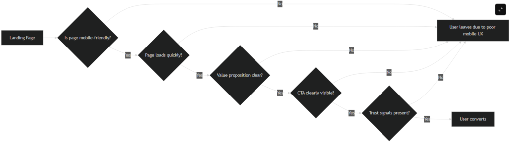
Now that you’ve identified what to fix, it’s time to take action. Our team specialises in conversion-centric redesigns. We fix these issues professionally, so your website not only looks great, but also drives leads and sales. Let us optimise your site’s design and UX, guiding every visitor toward the right action – contact us today to get started.