
In today’s competitive digital landscape, your website isn’t just a brochure – it’s a conversion engine. But how do you ensure that your design actually converts visitors into customers? In this guide, we’ll cover the latest 2024–2026 trends and best practices for creating a high-converting website. You’ll learn how to optimise every element – from layout and copy to performance and SEO – to maximize your conversion rates.
Conversion Rate Benchmarks & Why They Matter. First, let’s set the stage with some data. Across industries, the average website conversion rate is only about 2–3%. That might sound low, but remember: even a 1% increase can double your revenue. In fact, raising a 1% rate to 3% effectively triples revenue. The top 25% of websites convert at roughly 5.3% or higher, so there’s plenty of room to grow. This means small tweaks to design and messaging can have a huge ROI. No wonder CRO (conversion rate optimisation) budgets and tools are soaring (a $1.9B market by 2026).
Trend: Mobile-First is Mandatory. By 2025, as much as 64–75% of web traffic comes via mobile. Google now crawls and ranks based on your mobile site first. So, mobile-friendly design is non-negotiable. Make sure navigation, buttons, and forms work seamlessly on smartphones. Use responsive layouts that stack content logically on small screens. And don’t forget performance: mobile users expect instant load. Studies show mobile-optimised sites have 23% higher conversions and much lower bounce rates. If your pages load slowly or elements don’t fit a phone screen, visitors will bounce (on average, about 50% of visitors leave after one page). In short, design mobile-first, test on devices, and keep it snappy.
Core Web Vitals & Speed. Speed kills…bounces and sales. Google’s “Core Web Vitals” define user-centric performance: pages should load their main content in <2.5 seconds (LCP) and not unexpectedly shift layout (CLS) or hang on user input (INP). Why does this matter for conversions? Because every extra second of delay can cost you ~20% of conversions. For example, Walmart found that a 1-second speed-up gave a 2% conversion lift. So compress images, serve via CDN, lazy-load below-the-fold content, and reduce heavy scripts. Test your site in PageSpeed Insights or Lighthouse and aim for “Good” scores. The faster and more stable your pages, the more likely users will stay and convert.
Value Proposition & Messaging. First impressions count. When visitors land, they need to instantly know “what’s in it for me.” Craft a clear, concise value proposition in your headline and subheading. Avoid generic claims like “best service” – be specific (“reduce taxes by 30% in 2 months”). Use the customer’s language: check support tickets or surveys to learn how they describe the problem, and mirror that wording. Place this value statement above the fold, at the very top of the page. Consistency matters: if an ad or social post promised a benefit, make sure your landing page repeats that benefit clearly (inconsistent messages confuse visitors).
Call-to-Action (CTA) Optimization. Your CTA button is the gateway to conversion, so make it irresistible. Write action-oriented text: instead of “Submit”, say “Get Your Free Quote” or “Claim My Discount”. First-person phrasing works wonders: shifting from “Start your free trial” to “Start my free trial” has been shown to almost double clickthroughs. Visually, the button must pop: use a color that contrasts with your palette and surround it with whitespace to draw the eye. Place the primary CTA in the top-right and on a strong hero banner, and repeat it after major sections on longer pages. Only one CTA per section should dominate; secondary options (e.g. “Learn more”) should be styled smaller or ghosted to avoid distraction. Remember to test. Even button color or wording tweaks can yield double-digit percentage increases.

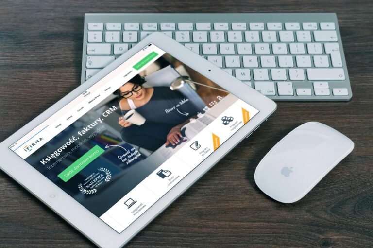
Above: A high-impact CTA example (a prominent “Get Started” button) with clear action-oriented text, illustrating how design can guide users towards conversion.
Trust and Social Proof. People are naturally skeptical online (“Can I trust this site?”). Reduce anxiety by showcasing proof that others have already said “yes.” Sprinkle testimonials, reviews, logos of well-known clients, and social proof counters across your site. Credible, detailed testimonials pack a punch (“This company increased our leads by 40% in 3 months!”). If you have numbers (“10,000+ customers served” or star ratings), display them next to your CTAs. Group107 notes that seeing faces, names, and concrete stats greatly builds confidence. Place these elements near conversion points (e.g. alongside a signup form) to tip the decision.
Clean, Focused UX/UI. A clear layout and visual hierarchy guide the eye towards your conversion goal. Start with an uncluttered hero section: big headline, subhead, and CTA, possibly alongside a compelling image or graphic. Use grid layouts for features or benefits (e.g. 3–4 columns with icons or images and short blurbs). Alternate text and visuals in a zigzag pattern for long scroll pages. Keep typography readable and colours consistent with your brand. Ensure the primary action button (usually in a bright color) stands out on each page. Checkmark bullet lists (e.g. key benefits) can succinctly convey value. Overall, every page should “flow” towards the CTA, with a logical path of least resistance (minimal clicks or scrolls).
Persuasive Copywriting. Beyond layout, the actual words must convert. Lead with benefits, not features: “Save 5 hours each week” instead of “Widget X has Y features”. Use concrete numbers (“25% more leads” is more convincing than “significantly more leads”). Inject power words (“Discover”, “Unlock”, “Proven”, “Instant”) to evoke emotion. Address objections head-on in your copy: phrases like “No credit card required” or “Cancel anytime” can relieve fear of commitment. On longer pages, structure your message like a mini-story: highlight the problem, agitate it (make it relatable), then present your product/service as the hero solution, culminating in a strong CTA. Every sentence should pull the reader closer to the goal.
Microinteractions & Engagement. Small animations and effects can delight users and make your site feel more polished. For example, hover effects on buttons (slight growth, color change, or shadow) give feedback that the element is clickable. Showing form validation in real time (turning a field green with a checkmark as the user types correctly) encourages form completion. Use loading animations or skeleton screens to indicate progress when content is fetching. Google’s UX research shows that subtle animations make sites feel faster (users perceive 5–8% quicker response) and more enjoyable. However, keep them minimal and performance-friendly: every animation should have a purpose (confirmation, guidance, or delight), and should be very quick (under 200ms) so as not to slow the user down.
Mobile-First & Responsive Design. We touched on mobile traffic, but let’s emphasize strategy. Design for the smallest screen first: decide what absolutely must be in the mobile UI, then scale up for desktop. This approach forces clarity and prioritisation. Common mobile practices: collapsible hamburger menu, large tap-target buttons (recommend >44px), and minimizing heavy media. Simplify forms on mobile (autofill where possible, use dropdowns sensibly). Always test on actual devices (iOS and Android) to catch touch usability issues. Remember that mobile users are often on-the-go; you need to grab their attention fast. Flutebyte’s work shows that well-executed mobile experiences can drastically increase engagement and sales, especially in retail or services where quick answers matter.
Accessibility & Inclusive Practices. Don’t forget users with disabilities or diverse needs. Follow best practices (WCAG): ensure text has high contrast, images have alt text, videos have captions, and navigation is operable by keyboard. Think of inclusive features like adjustable font size or a dark mode toggle for readability. Nielsen Norman Group reminds us that inclusive design means enabling people of all backgrounds and abilities. In practice, that could mean providing content in multiple languages if you serve global markets, or ensuring your color choices don’t exclude colorblind users. Accessible sites actually convert better for everyone: e.g. captions not only help the hearing impaired but also users browsing in noisy places.
Data-Driven Testing & Iteration. Conversion optimization is never “set and forget.” Use analytics to guide decisions. Set up Google Analytics 4 (or Matomo) to track user flows and conversion funnels. Employ heatmaps/recordings (Hotjar, Microsoft Clarity) to see where users hesitate or rage-click. Identify the single page with the worst drop-off and fix it first. Then establish a testing roadmap: prioritize changes that need low effort but promise high impact (the classic low-hanging fruit). For example, if your homepage slider (rotating images) has very low click-through, try a static hero with a clear message instead. Each test should have a hypothesis (e.g. “Reducing signup fields will increase form submissions by 10%”) and run until statistically valid results. Capture all learnings in one place; even failed tests are informative. Over time, this ongoing experiment-and-learn cycle compounds, making CRO a core part of business strategy rather than a one-off project.
Analytics & Key Metrics to Track
With new design changes live, monitor these KPIs: conversion rate (overall and by channel), landing page bounce rates, click-through rates on CTAs, form abandonment, and average order value (for e-commerce). Also keep an eye on speed metrics: Google Search Console will show Core Web Vitals scores and any mobile usability issues. Tools like GA4 allow you to segment conversions by device, traffic source, and location – use these to refine personalization strategies. We’ve found (as industry research confirms) that sites with a testing culture outperform those without: in one survey, less than 20% of marketers regularly A/B test – don’t be left behind.
SEO & Content Structure
A well-optimized site not only converts better, but also ranks better. Use descriptive, keyword-rich headings (your main keyword high converting website design should appear in the H1/title). Break content into scannable sections (H2/H3), and include your keyword or variations in at least a few subheadings. Write a compelling meta title and description (see above) to improve click-through from search results. Implement schema markup for articles (e.g. <script type="application/ld+json"> with BlogPosting) so search engines can create rich results. Ensure each page has an SEO-friendly URL (e.g. /high-converting-website-design-guide). And remember: internal linking helps both users and SEO. Link related blog posts or service pages contextually (e.g. “learn more in our case studies of website redesign”). Finally, keep mobile and speed optimizations in mind, as search algorithms favor sites that load quickly and offer a good mobile experience.
Examples & Case Studies
Here are two concrete examples of design-overhaul success:
- B2B Site (Incremental Testing): A B2B supplier worked with experts to iteratively redesign their site. By A/B testing copy and layouts section-by-section, they achieved a 250% increase in demo requests over six months. Notably, each redesign element was tested before full rollout: a new category page design yielded more visits to the demo page, and optimizing the demo landing page (removing irrelevant video, adding a clear product image) led to significantly higher form completions. The lesson? Build and test step-by-step. Flawed assumptions were caught early, and fixes at each stage piled up into large conversion gains, even before the full redesign was finished.
- Service Company (Before/After Stats): An SME in services was getting traffic but few leads. After a thoughtful redesign focused on performance and clarity (not just look), the results were striking. In 3 months post-launch: bounce rate dropped from 68% to 39% (–25%), and average session duration jumped 40%. Page load time plummeted from 6.2s to 2.1s, and mobile usability errors were resolved – naturally boosting engagement. Even without paid ads, organic traffic began to rise as user experience improved. (This example mirrors Flutebyte’s advice: fast, user-centric design lifts both SEO and conversions.)
- Flutebyte’s Own Impact: While we won’t share proprietary client data, we can say that our emphasis on performance and CRO pays off. Flutebyte’s portfolio of 300+ websites has collectively generated $25M+ in online revenue for our clients. We focus on integrating analytics into every project – as our services page notes, “every website is integrated with Google Analytics and Search Console” for ongoing optimization. We’ve also observed (anecdotally, backed by studies) that each second of speed gain corresponds to roughly 20–30% lift in conversion.
These examples underline the report’s key message: data-driven design leads to real business results. Now, let’s summarize next steps.
Key Takeaways & Action Plan
- Design mobile-first and speed-optimised. Mobile traffic dominates, so prioritize a responsive, fast-loading site.
- Articulate a crystal-clear value prop and use prominent, contrasting CTAs with strong copy. Above all, answer “what’s in it for the user.”
- Build trust with authentic social proof and accessible design. Make your site usable by everyone.
- Test relentlessly. Use A/B testing and analytics to validate every change. Employ AI tools for personalization and faster insights where possible.
- Structure content for humans and search engines: use keyword-rich headings, meta tags, and schema.
By following these guidelines – which blend current industry research and proven CRO tactics – you’ll set up a sustainable process for continuous improvement. Your website can become a powerful conversion machine, driving more leads and sales in 2026 and beyond.